Nowo
Building a new oriental fashion movement in Brazil
While everyone knows that the Japanese community in Brazil is very large, few people are aware of a very specific clothing problem that affects women of this ethnicity: the difficulty of finding suitable clothes for the oriental biotype, made up of straighter, rectangular bodies.
Nowo was created to meet this demand, and we were asked to create the brand’s entire visual identity and verbal expression.
More than simply offering clothes with the right cuts for consumers of Japanese descent, Nowo also seeks to combat the fast fashion culture and make sustainable, purposeful garments. More than dressing, Nowo seeks to rescue the legacy and identity of its audience.
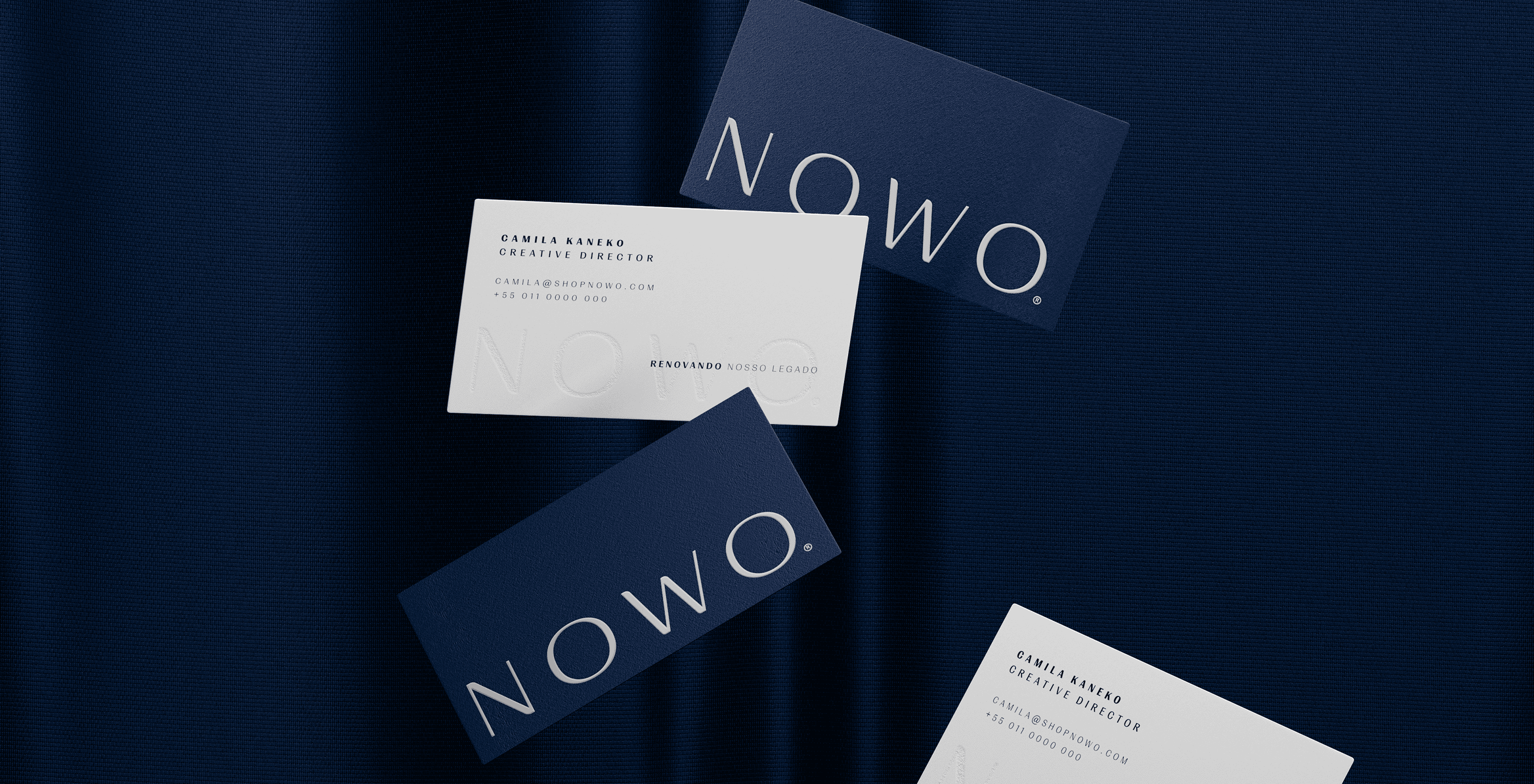
The logo’s typography was designed to convey this delicacy, while the choice of blue as the proprietary color helps to create a sense of harmony and tranquility.
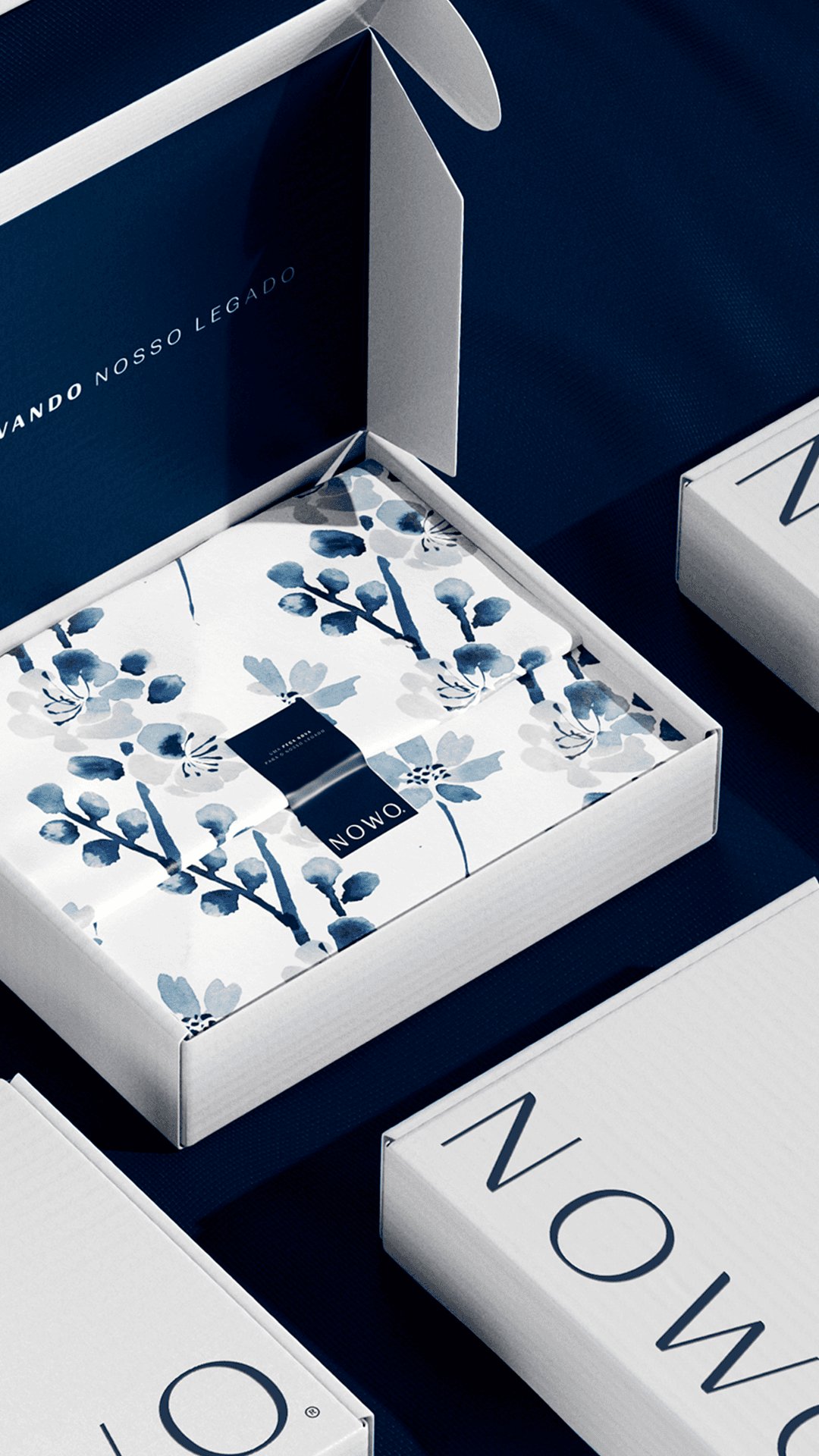
We developed the basis of the visual identity using very flexible shapes, thinking about applying the logo to photos and content for social networks, as well as a series of floral illustrations that reinforce the artistic aspect of the brand.
Designed using the Sumi-e technique, each flower represents a different season and takes center stage in the identity according to the time of year: Spring (Sakura and Tulip), Summer (Lotus and Hydrangea), Autumn (Higanbana and Cosmos), and Winter (Camellia and Ume).