Cuide-Se Bem Bob Esponja

Applying pop aesthetics to serve nostalgia
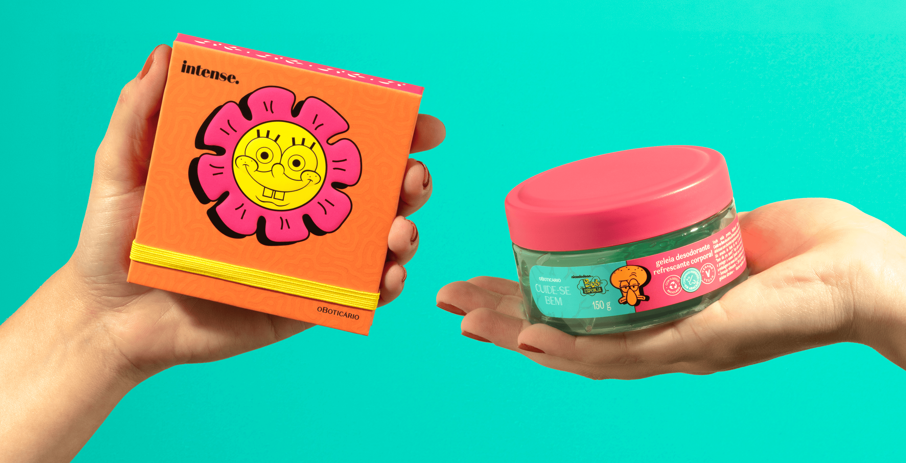
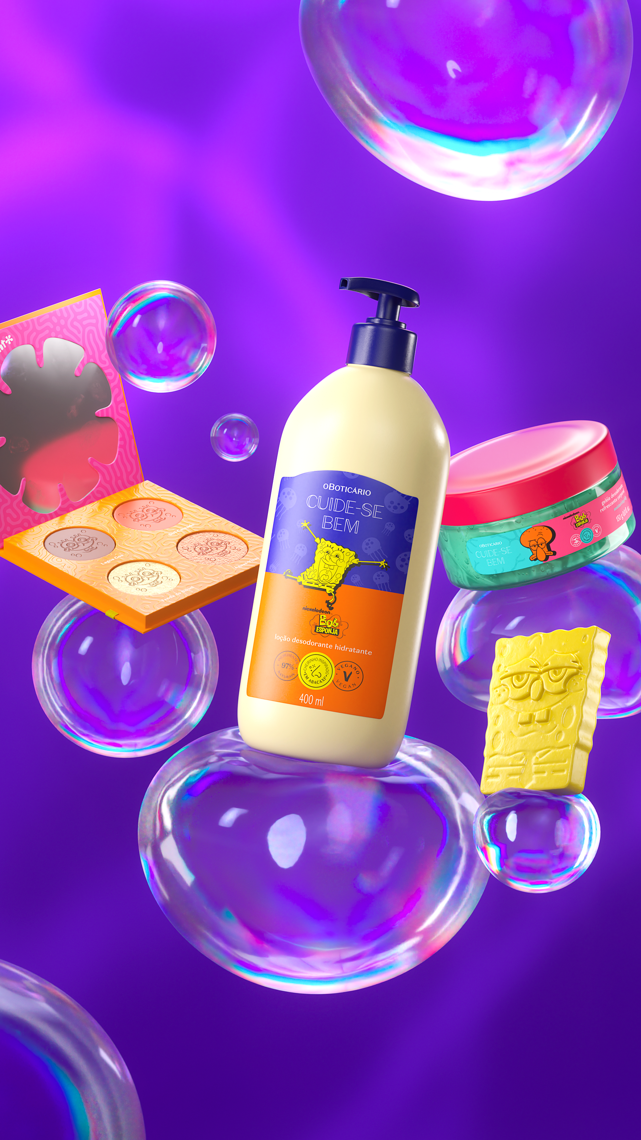
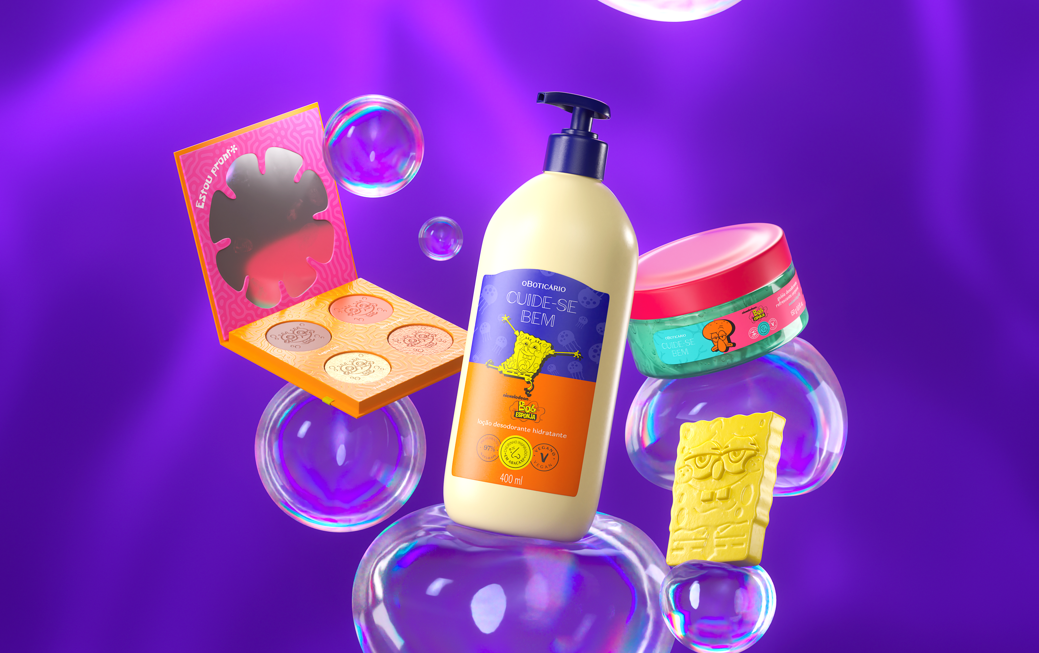
Our mission here was to combine the popularity of one of O Boticário’s biggest brands with the storytelling of one of the most recognizable (and beloved) cartoons of the last 30 years: SpongeBob.
We have created a wide range of products with a fun, but not childish, aesthetic. After all, our target audience is mainly made up of people who watched the cartoon every morning 15 or 20 years ago.
The creative strategy was based on the use of vibrant colors, with the aim of bringing a more pop and modern look to the products. That’s why the primary colors aren’t necessarily those most associated with each character. Patrick is green and Squidward Tentacles is orange, for example.
We combined this aesthetic with patterns inspired by very recognizable elements of the show, such as jellyfish, and a whole bunch of easter-eggs scattered around the packaging.